Hi, I'm Alper Eslek

Managing every aspect of a product lifecycle, from market research to post-purchase customer experience, while employing data analysis for strategic, data-driven decision-making and communicating insights through visualizations.

PORTFOLIO
Hi, I'm Alper Eslek
Brand Manager
Branding
This is an overview of the Molermo brand, focusing on understanding what users want in the 'why' section. Just below, it looks closely at the Molermo name and slogan. On the right, you'll see the brand's position and the 'elevator speech'. Finally, at the bottom, it shows the customer journey. This one-page presentation was made using Adobe Photoshop.

The initial focus is on repeatedly asking the 'why' question to comprehend the authentic needs of users. Uncovering the right answer will guide more accurate decisions, spanning from product naming to marketing strategies, and boost the likelihood of success in our endeavors.
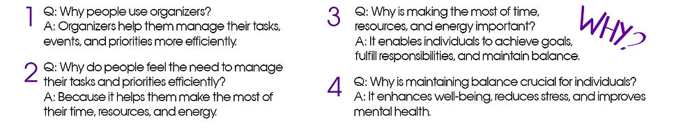
Why do people use organizers in their daily lives? It's because organizers help them manage tasks more effectively. So, why do they seek this? As we persist in asking these questions, it becomes evident that people fundamentally want to reduce stress and lighten their mental load. Henceforth, we will consider this in all our actions.
In the upcoming section, we delve into the selection of the name Molermo for the brand, providing insights into the reasons behind its slogan, and explaining the motivations for its choice of colors.

The name Molermo was chosen because it's short, easy to remember with the repeated 'mo' parts. It was also quick to legally protect because it's a new and unique name. Having no big, similar brand in Google searches means Molermo won't be overshadowed. The name is flexible, fitting well if the target audience or product changes later on. It's appealing and works in any country, which was important in picking the name.
The 'inspired' element in the slogan underlines the brand's dedication to staying creative. The brand will continuously bring in new and imaginative products or infuse creativity into existing ones on the market. It will never create generic or ordinary items. The 'simplicity' part refers to the brand's goals of promoting a 'stress-free life' and 'reducing mental load.' We achieved these goals by consistently asking users the 'why' question.
The brand picked purple lavender and white colors. Purple lavender makes people feel calm and wise in neuromarketing, while white gives a pure feeling. Choosing these colors is because they match the brand's main goal.
In the elevator pitch, there's a short and clear message about the brand. Also, there's a message below, showing that the brand aims to display its personality at every interaction.

On the far right of the overview, we observe the brand's brand positioning. The selected target segment consists of people who organize their belongings. Behavioral segmentation was employed as the segmentation type. The 'point of difference,' meaning the reason people choose us, will always be ease of use and the innovative approach we mentioned earlier. Our frame of reference is organization solutions.
At the bottom of the overview, there's a customer journey. To ensure effective branding, ensure that what was mentioned earlier is applied at each step shown here. Our users should receive the message our brand wants to convey at every touchpoint where their journey intersects with our brand, from the beginning to the end.

That's why a simple and innovative design was chosen for the product. Buying it is safe and easy, using trustworthy methods for payment, and the delivery reaches you quickly. The box is designed to be simple and stylish, and it's easy to open. The product is ready to use right after you take it out of the box, without needing any assembly. All of these are the results of the branding strategy.
ALPERESLEK